

Editing photos from spring dog photoshoots | Toronto pet photographer
/As I’ve been walking around my Toronto neighbourhood, getting some outdoor exercise and enjoying the new warmth of the season, I see little signs of spring everywhere. Without doubt this is my favourite time of the year. Spring flowers are starting to emerge and everything is quickly turning from dull brown to beautiful green. Green is the colour we most often associate with life and in nature I love it and find it uplifting and calming.
But the colour green can be a frustrating problem for dog photographers! When taking outdoor photos in the spring, green often appears so vivid and strong in the photographs, that it drowns the subject in a sea of electric brightness.
When I edit my outdoor images the colour green is sometimes difficult to get right. I usually try to tone it down. Sometimes I simply desaturate it. I may remove some of the yellows - green contains a large amount of yellow. Other times I may use a blue green tone, depending on what I think looks best in a particular photograph.
To give you an example of some edits that I may consider when I work on the images from your pet photo shoot, take a look at this series of photos of my little friend Miley. I took this image at Alexander Muir Memorial Gardens in Toronto. I loved how she was almost posing for me on the log, but I really felt that the green of the foliage and forest was way too overwhelming. I tried a variety of different methods of processing the greens.
The changes may be very subtle but they make all the difference in the final images that I present to you after your photo shoot.
A quick side-note, prior to editing for the green colour, I had also removed her owner and leash from this photo and made a few other edits as well. However because the focus of this post is on how I edit the green colour, I am showing the photo after those other edits have already been made. [If you are interested in the actual “straight out of camera” photo, just let me know and I’l be happy to show you]
First up is the original image, before I edited the green colour.
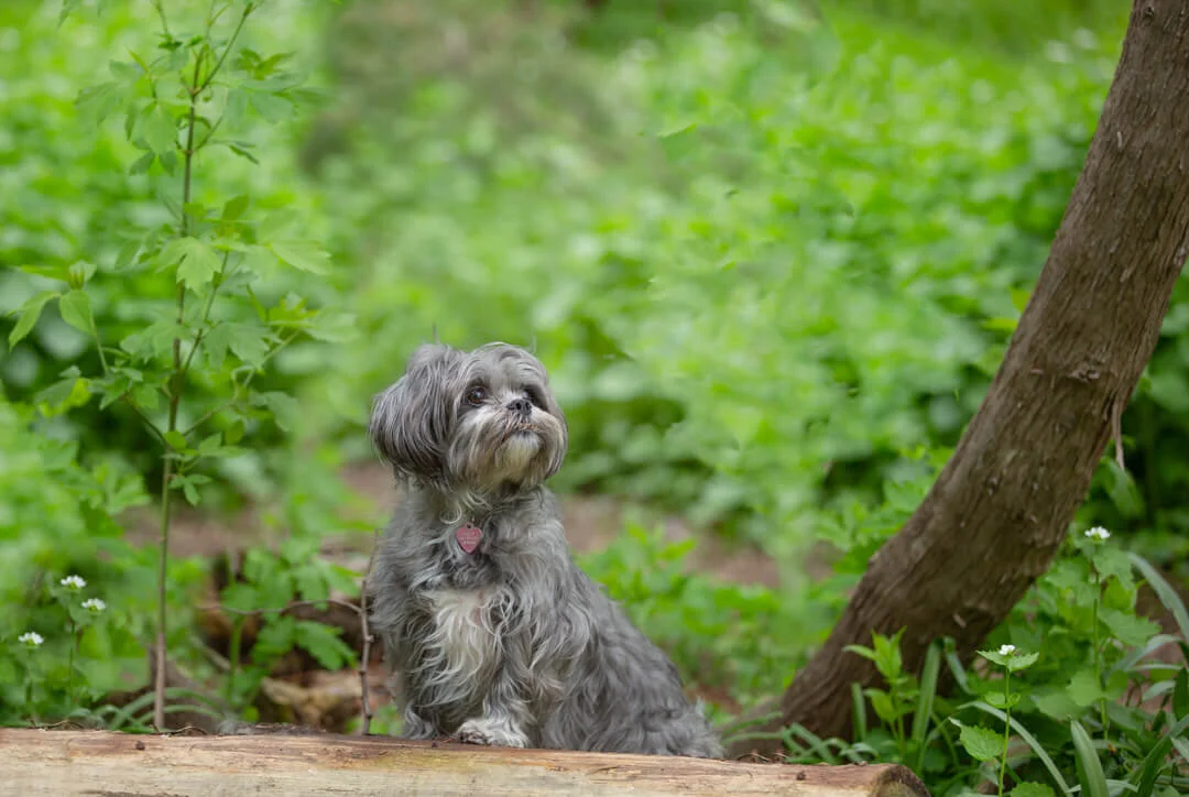
ORIGINAL PHOTO - GREEN IS WAY TOO INTENSE!
In this image, I have changed the green to a more blue-green colour by removing some yellow tones and adding blues to the green tones. This makes the image a very “cool” image. There are no warm yellow or orange tones.

BLUE-GREEN VERSION. IT IS A VERY “COOL” TONED IMAGE
In the third image I maintained the warm tones by not removing the yellow colour from the green, but simply desaturated the green so that it did not appear so overwhelming.

SLIGHTLY DESATURATED GREENS - VERY NATURAL
And then finally I kept the greens from the third image but added a little bit of warmth.

THIS IS THE SAME AS NUMBER THREE BUT JUST A SLIGHT BIT WARMER
Are you wondering which one I chose to show my client? It was number four.
I think it is a nice natural looking photo and also I preferred a slightly warmer tones.
Which is your favourite?
At the end of the day, the most important part about colour is simply what looks good to your eyes.
I am looking forward to getting out into our Toronto parks and ravines for some wonderful spring dog photography!
Please feel free to contact me for more information regarding a photo shoot for your pet and family.
Elaine Tweedy of I Got the Shot Photography, capturing favorite colors all over Northeastern PA and surrounding areas, a talented member of our pet photographers circle, has also written a blog post on colour in pet photography. Check it out here to see what colour she has focused on.


